
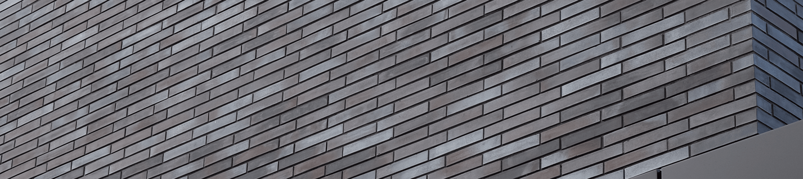
Best Brick Colours for Modern & Classic Home Exteriors
Brick colour is one of the biggest design decisions you’ll make for an exterior, shaping its mood, character and overall style. From timeless reds to contemporary greys and dramatic blacks, the right colour can help define the entire project.
How Brick Colour Shapes an Exterior
Colour has a powerful influence on how we read a building. Warm colours can make an exterior feel inviting and established, while cooler neutrals often create a quieter, more contemporary impression. Dark brick can add drama and definition, while pale colours tend to create a softer, lighter appearance. Brick also offers something that a flat painted surface cannot: natural variation. A brick may be categorized as red, grey or brown while containing several related shades across its surface. That variation can add depth and character when viewed across an entire façade.
At kreitmaker, the available brick collections span colours including white, grey, brown, red, orange, yellow and black, along with more distinctive specialty colours. This range allows brick to complement many different architectural styles rather than being limited to a traditional aesthetic.
Red Brick: Familiar, Warm & Timeless
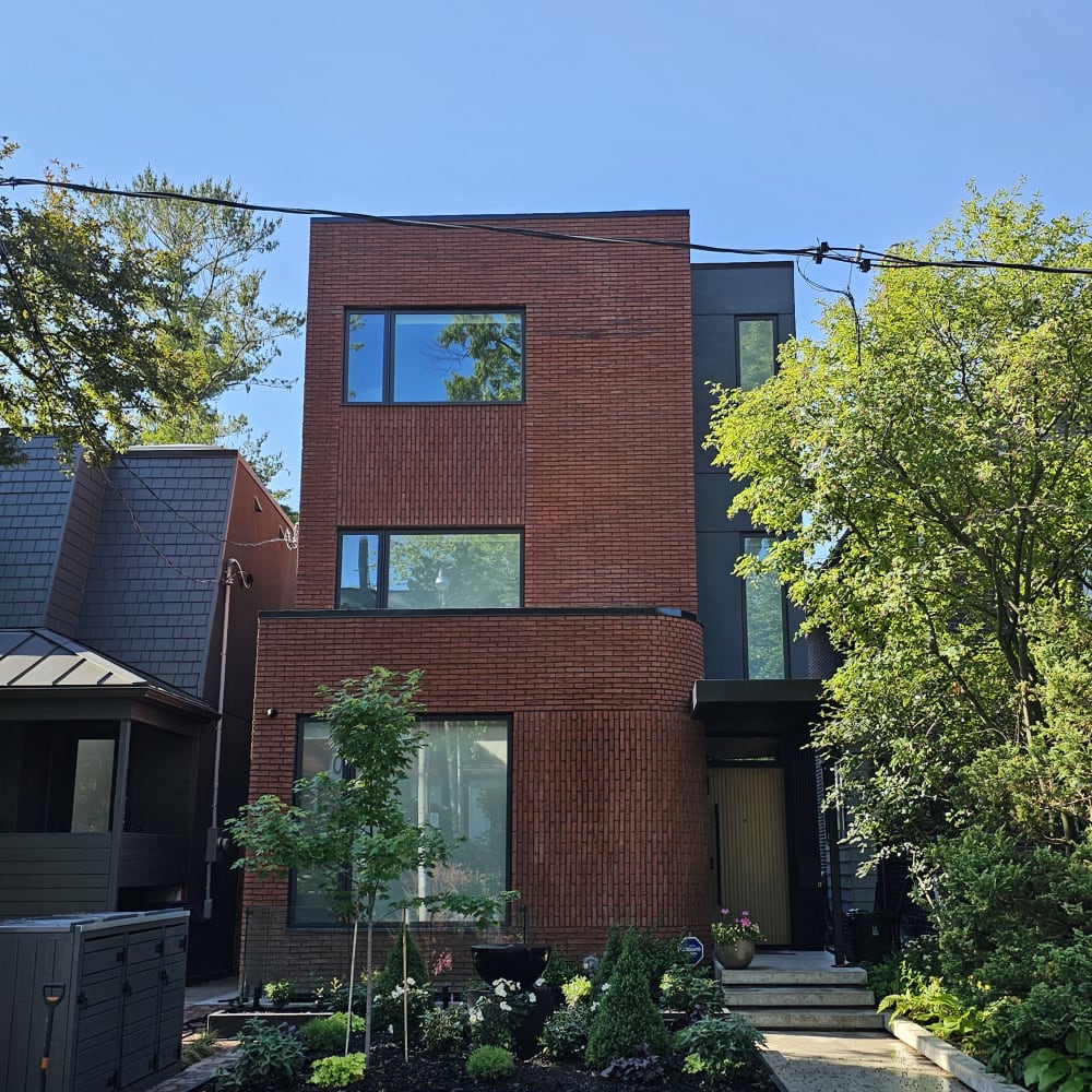
Red brick remains one of the most recognizable choices for exterior design, and for good reason. Its warmth gives a building an established character that works naturally with traditional architecture. For a classic exterior, consider rich reds, burnt reds and blended bricks containing subtle brown or orange tones. These colours pair comfortably with cream trim, natural stone, dark roofing and traditional architectural details.
Red brick does not have to feel strictly traditional, though. A cleaner red brick paired with black-framed windows, simplified detailing and a restrained material palette can create a much more contemporary result. The difference comes down to the surrounding design choices. For projects inspired by traditional European architecture, Nelissen offers a selection of richly coloured bricks with natural tonal variation, bringing warmth and character to both classic and contemporary exteriors.
This flexibility makes red brick particularly useful for projects that need to feel connected to an established streetscape while still expressing their own identity.
Brown & Earth-Toned Brick: Warm & Understated
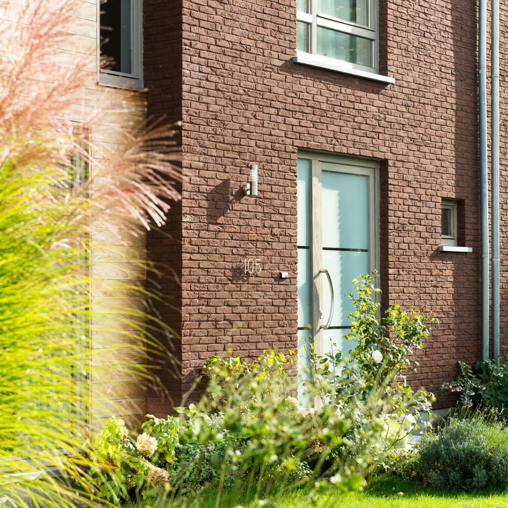
Brown brick sits comfortably between traditional and contemporary design. Chocolate, taupe, tan and brown-grey blends can create warmth without making the same visual statement as classic red. These earthy colours work especially well when the design includes other natural-looking materials.
Stone, wood tones and warm metal finishes can all complement brown brick and create an exterior that feels layered rather than overly coordinated. For a traditional direction, look for bricks with greater tonal variation and warmer undertones. Nelissen’s European brick collections are also worth exploring for their earthy colour blends and textured finishes, which complement both rustic and refined architectural styles.
For something more modern, deeper brown or brown-grey bricks can create a quieter, more streamlined appearance. Brown is also a useful choice when you want the brick to anchor the design without becoming its most attention-grabbing feature.
White & Cream Brick: Bright, Refined & Versatile
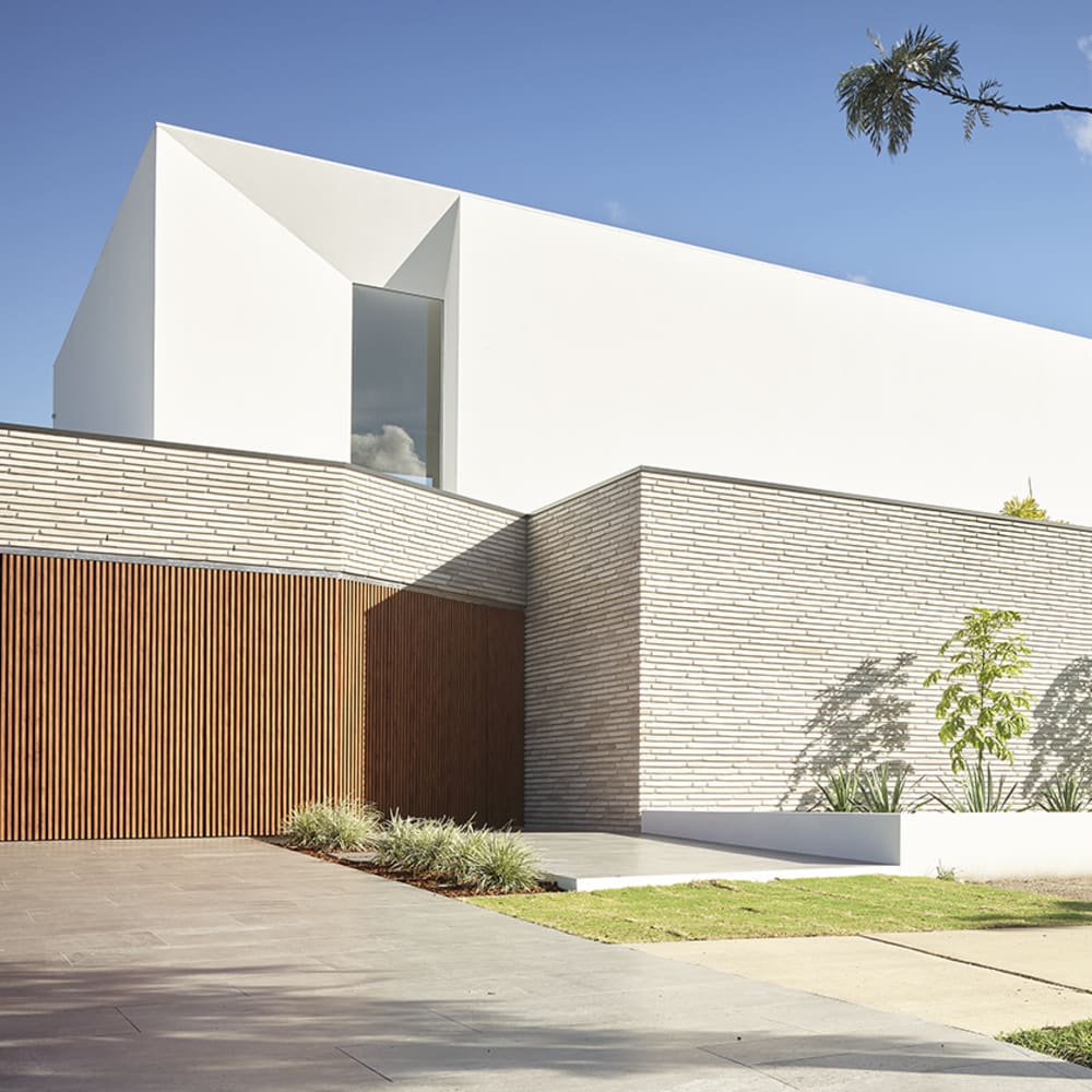
White, cream and other pale bricks can completely change the visual weight of a brick exterior. Instead of feeling heavy or rustic, the façade can appear bright, refined and understated. On modern projects, pale brick works especially well with black or charcoal windows, simple rooflines and minimalist landscaping.
The contrast creates definition while keeping the overall palette restrained. For classic architecture, creamier shades can create a softer effect. Warm white, ivory and buff-toned brick can complement traditional details without producing the stronger contrast associated with bright white. For a refined, contemporary look, Randers Tegl offers elegant light-toned brick options that pair beautifully with minimalist architectural details and contrasting finishes. Pale brick does not need to be perfectly uniform, either. Subtle variations of white, cream, grey or beige can add texture and prevent a large façade from appearing flat.
Grey Brick: Quietly Contemporary
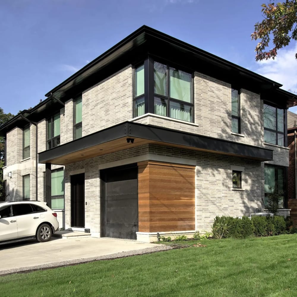
Grey has become an important part of contemporary exterior palettes because it offers neutrality without disappearing into the background. Light grey brick can create an airy, understated appearance, while medium greys bring more definition. Charcoal-grey shades move closer to the dramatic effect of black brick without becoming quite as bold. Grey can also be surprisingly versatile. Shouldice offers a range of sophisticated grey brick tones, from soft, understated shades to deeper charcoal hues, making it a versatile option for contemporary exterior designs.
Pairing it with black metal and dark window frames can push the design in an unmistakably modern direction. Combining a warmer grey brick with wood, stone or softer trim colours can make the same palette feel more transitional. That ability to shift between architectural styles makes grey especially useful when the goal is a contemporary exterior that still feels approachable.
Black & Charcoal Brick: Bold & Architectural
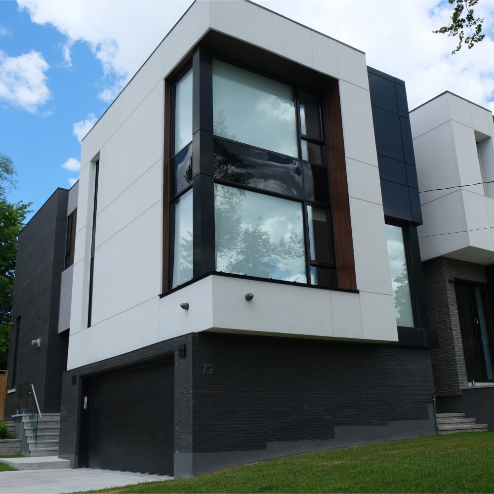
For projects designed to make a statement, black and near-black brick create a strong architectural presence. Deep charcoal, graphite and black tones can emphasize clean lines and simple forms, particularly when paired with similarly dark windows and trim.
Using a closely coordinated palette creates a monolithic look where the shape and texture of the building become the focus. Contrast can take the design in another direction. Black brick alongside warm wood, pale stone or lighter architectural details creates a much more graphic exterior. Dark brick can also be used selectively rather than across an entire façade. A dark brick volume, entrance or architectural feature can help visually define different parts of a project.
Yellow, Buff & Golden Brick: Heritage Character With New Possibilities
Yellow and buff brick colours are closely associated with many traditional architectural styles, but they offer more range than their heritage associations might suggest. Soft buff, sand and golden tones can create a warm, elegant exterior, particularly alongside limestone-inspired colours, cream trim and traditional detailing. Bricks that blend yellow with white, grey or brown can create additional depth. For contemporary designs, a lighter buff brick can also provide an alternative to white or grey. Paired with clean lines and simple detailing, it feels warm and distinctive without looking overly traditional.
Specialty Colours: Brick as a Design Feature
Brick colour does not have to stop at familiar neutrals and earth tones. Specialty and glazed bricks can introduce blues, greens and other more expressive shades into an exterior palette.
kreitmaker's brick selection includes specialty-colour options alongside more traditional brick colours. These colours can be particularly effective when brick is intended to become a focal point. Glazed brick can highlight an entrance, define an architectural feature or introduce a deliberate burst of colour to an otherwise restrained exterior. The Brick Development Association similarly notes that glazed brick can be used to emphasize individual design elements and add distinction to contemporary architecture.
Don’t Choose Brick Colour Without Considering Mortar
The brick itself is only part of the final colour story. Mortar colour can dramatically change how the exact same brick appears once it is part of a finished wall. A mortar colour close to the brick can visually blend the individual bricks together, creating a quieter, more continuous surface. A contrasting mortar makes each brick more defined and emphasizes the pattern of the masonry. That difference is significant because mortar makes up a noticeable portion of the visible façade. The Brick Development Association estimates that mortar represents roughly 17.5% of brickwork in a typical stretcher bond, while other patterns can increase that percentage. For that reason, brick and mortar colours should be considered together rather than as two separate decisions.
Finding the Right Brick Colour for Your Project
Start with the feeling you want the building to create. Do you picture something warm and established, bright and understated, bold and contemporary, or rich with traditional character? From there, you can narrow the palette to a colour family and begin comparing individual bricks, textures and tonal variations. Seeing brick in person is especially helpful. Colour, texture and variation can look different across a larger surface than they do in a photograph or individual sample. Industry guidance also recommends viewing samples or test panels under natural light to understand how brick, texture and mortar will interact.
kreitmaker carries a large selection of brick from Canadian and European brands, with options ranging from classic reds and warm earth tones to whites, greys, blacks and specialty colours. Visit a kreitmaker idea space in Scarborough, Leaside, or Davenport to compare samples in person and speak with our team about finding a brick palette that fits your design vision.